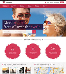
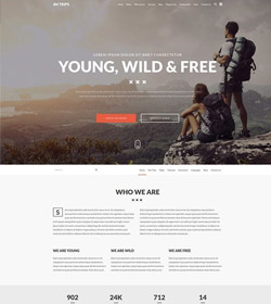
JM-Lifestyle Joomla 3.0 template uses fully responsive layout that adjusts to various screens: desktops, tablets or mobiles.
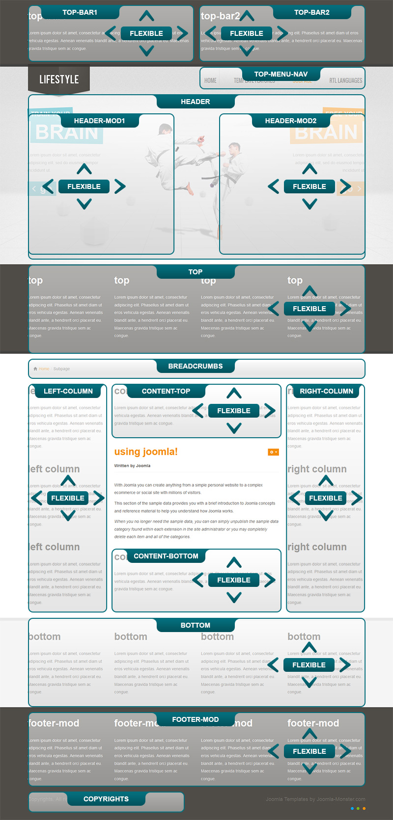
The layout supports default Bootstrap grid system of 12 columns. It means that you can display max. 12 modules in one row at one template position. Check the template positions to learn the layout scheme for JM-Lifestyle template.
Template layout positions for desktop & tablet - landscape orientation
Template layout positions for tablets - portrait orientation

Template layout positions for mobiles

